
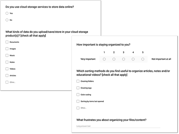
100%
Use cloud storage apps

84%
Save content through their browser bookmark tool

68%
Find organization important

60%
Find sharing content with others important
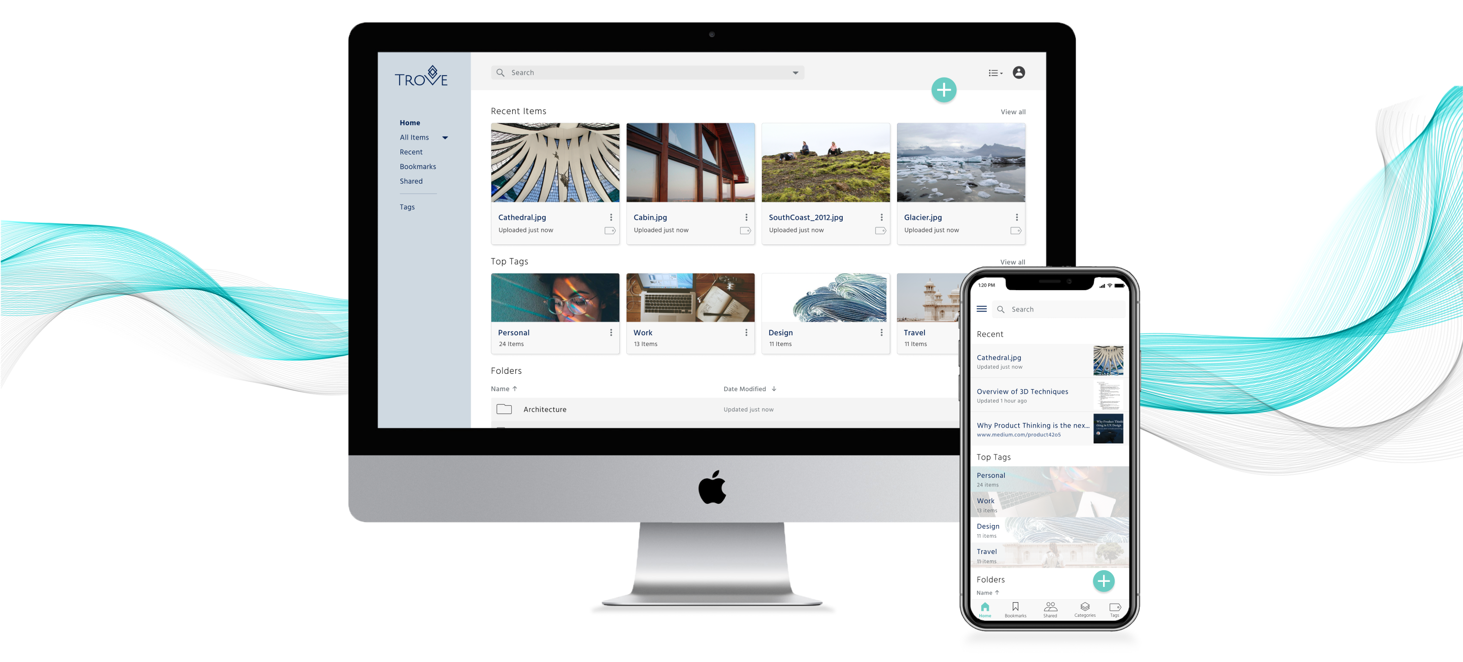

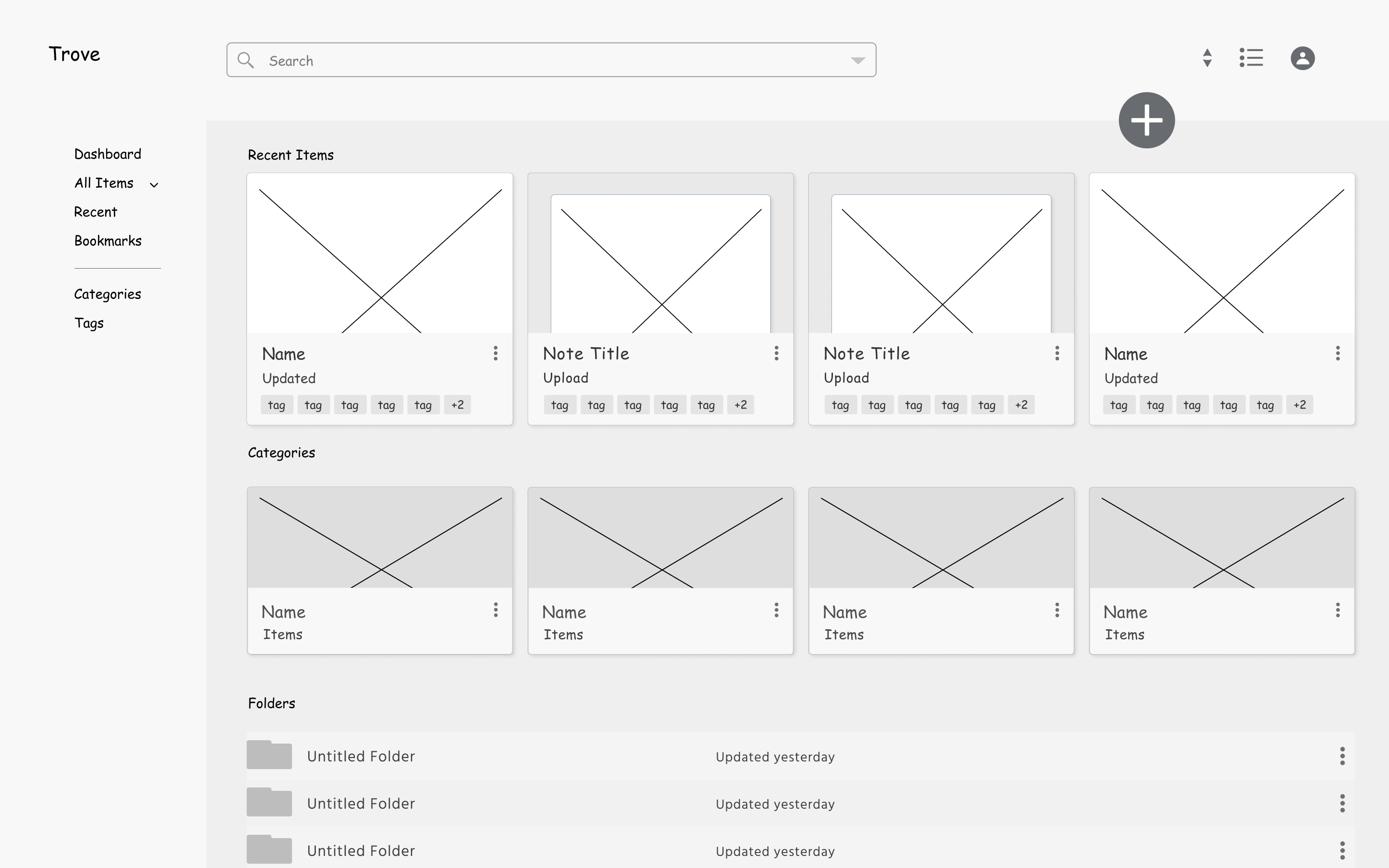
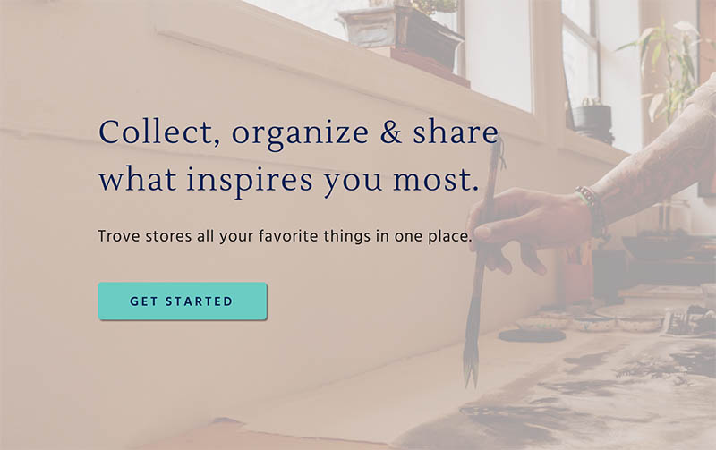
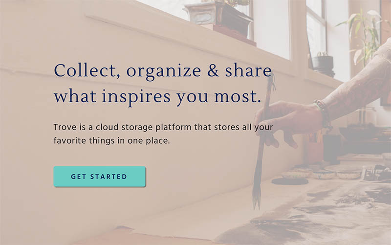
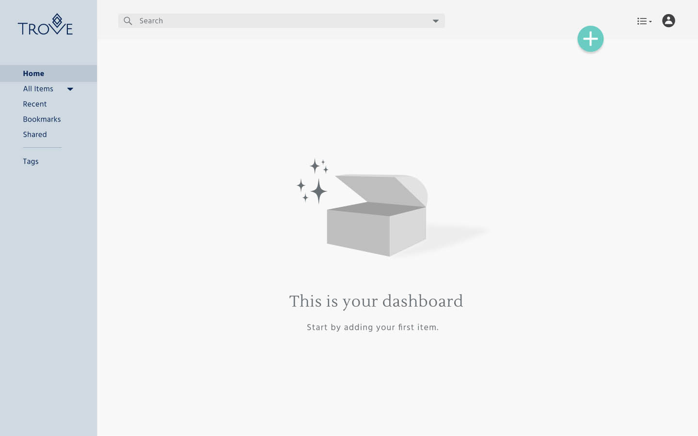
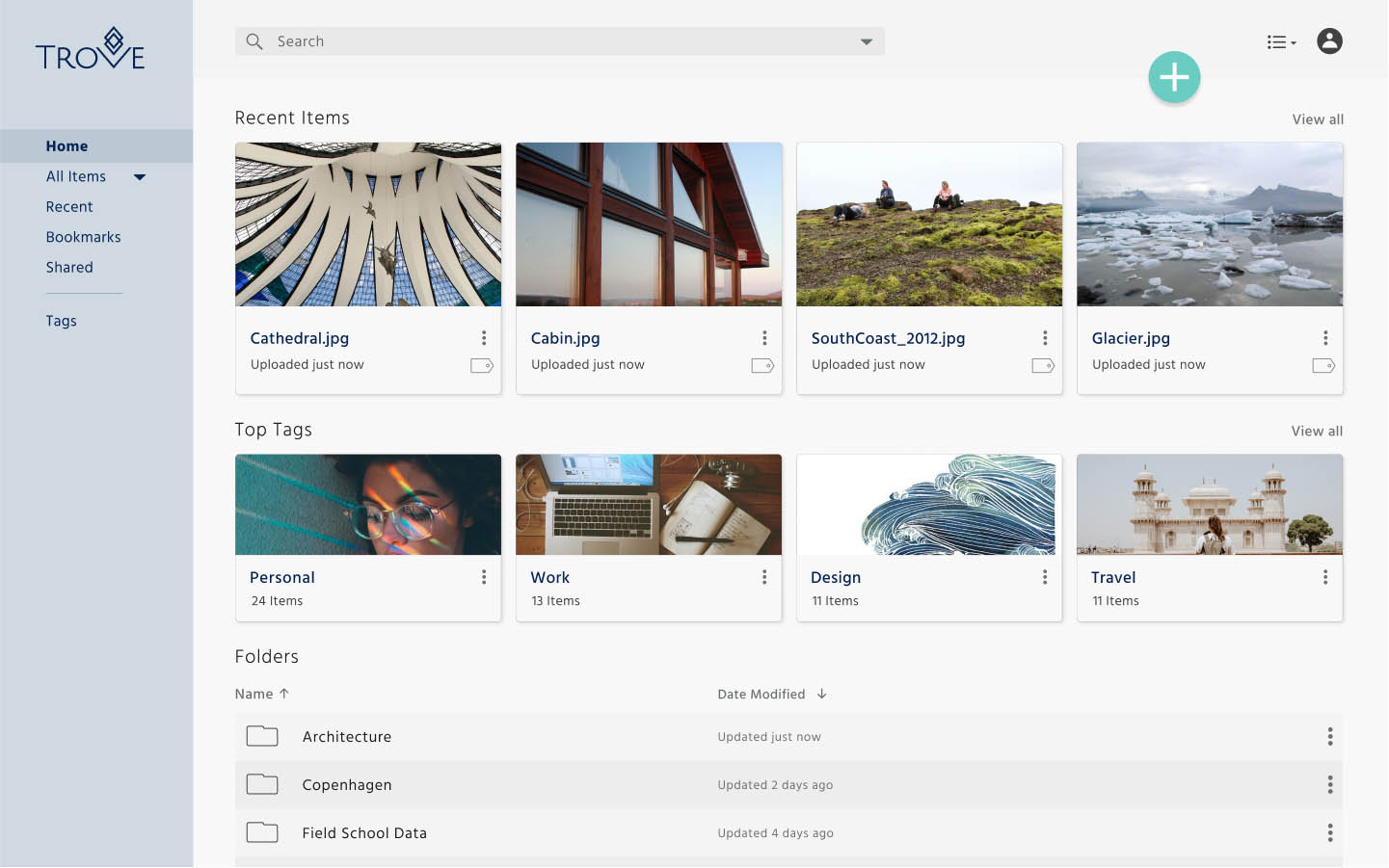
Trove is a responsive cloud storage application that improves file discoverability and organization through automatic content tagging. It is geared toward digitally savvy, multi-taskers who want access to their content on the go.
The cloud storage industry has evolved drastically in the last few years and users needs have evolved with it. I set out to uncover the problems users face today and build a product that met those needs.
The main problems users experience:
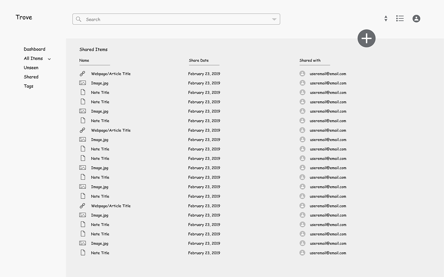
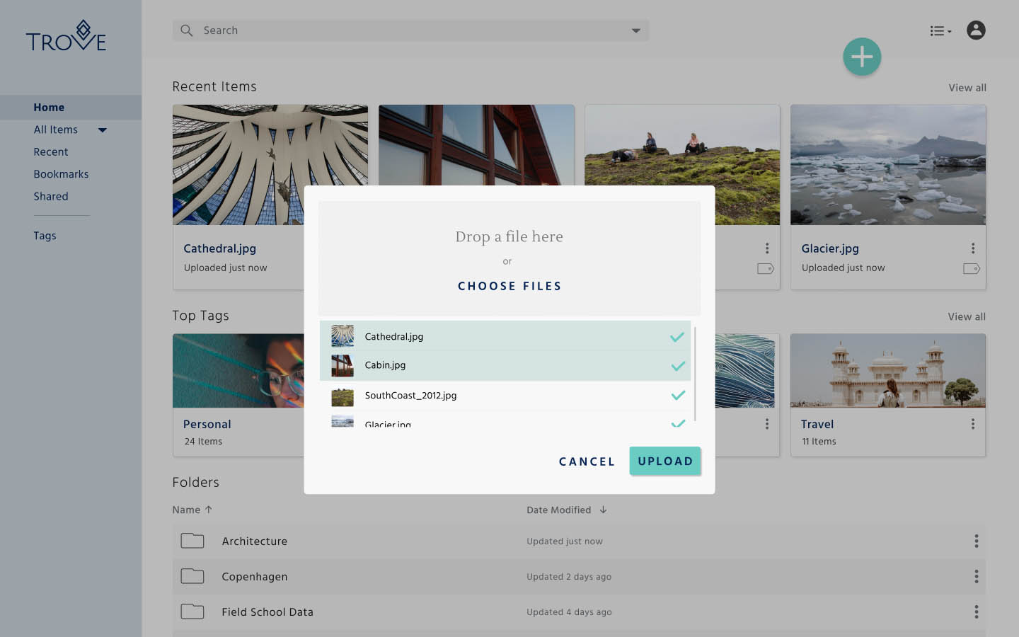
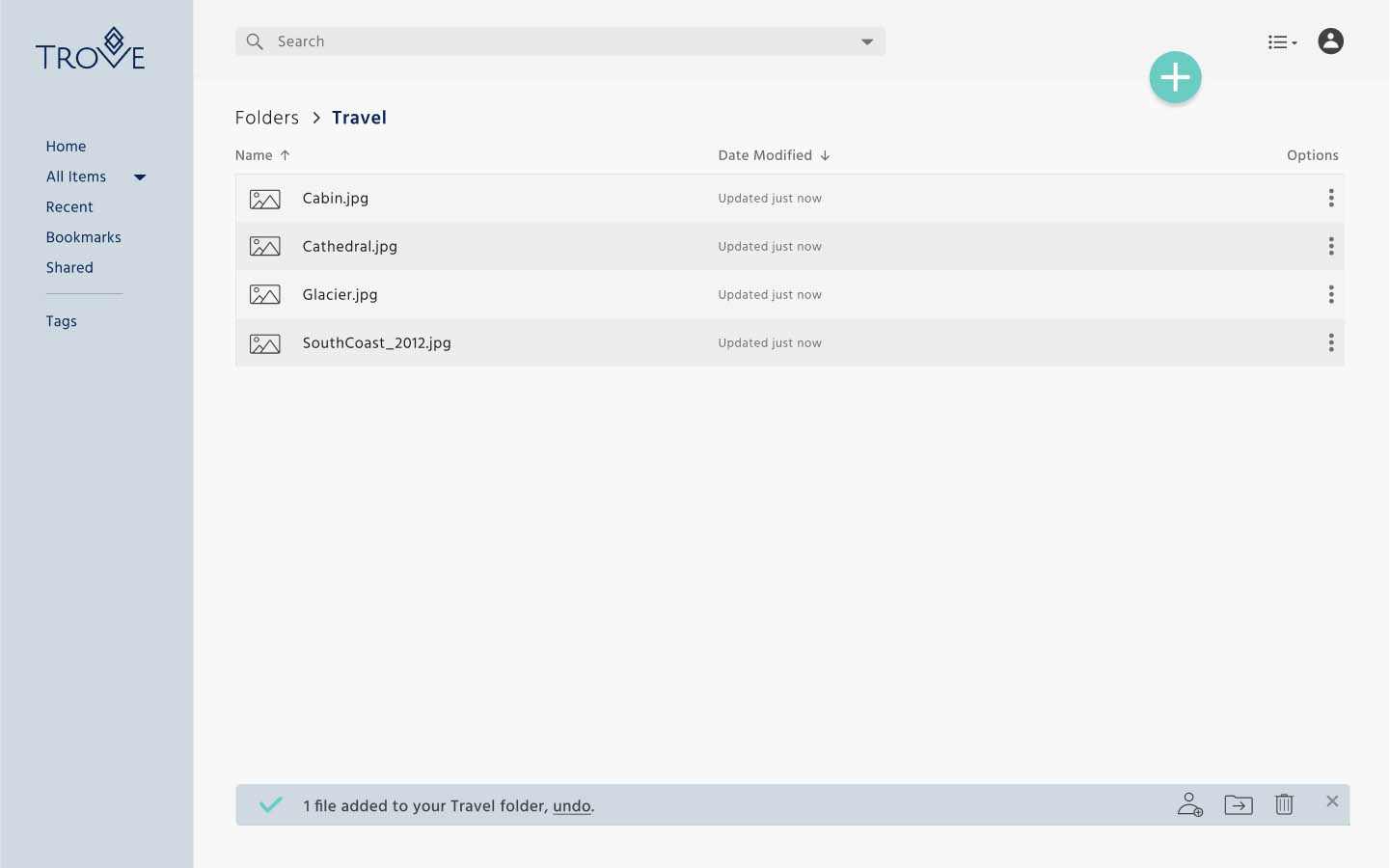
The solution is a flexible storage space that lets users store notes, images and links all in one place. Smart organization tools keep users on top of file management.
Key design features:

I started my research with a survey to discover what people were looking for in a cloud storage application, and what frustrations they currently experienced managing personal files, images, notes and bookmarks.
100%
Use cloud storage apps
84%
Save content through their browser bookmark tool
68%
Find organization important
60%
Find sharing content with others important

Access
Backup Security
Offload Storage Space
Simple Sharing
Collaboration
Industries

Gender

*Percentages based on 25 participants
To see where Trove fell in the market, I looked at other cloud storage products and content organization apps, such as Google Drive, Google Keep, Pocket and Pinterest. I analyzed each to find out what made them unique and where they could potentially improve.
A few common trends from the competitors:
Based on the survey responses, I realized that Trove’s primary audience was a group of:


Now that I had a clear idea of my users and their goals, I used the insights from two survey respondents to develop two different personas.
Policy Advisor, 30
Goals
“I like writing notes and saving things as I see them. I like to keep them organized in a meaningful way, so I can find them later on.”
Frustration
“I spend the majority of my day attending meetings, writing emails, organizing files for different projects. Searching for things I’ve seen in passing and digging through emails are inevitable parts of my day.”

College Students, 21
Goals
“I spend most of my time creating and sharing projects, sketching and writing notes during lectures. I like to save articles to Pocket and browses project ideas on Pinterest. I want to be able to organize my work without thinking too
hard and be able to send links or videos to friends and classmates.”
Frustration
“I use a lot of apps to bookmark things on my computer and phone--sometimes it’s hard to remember where I put them. I don’t spend a lot of time organizing my files. It’s an absolute nightmare finding things I need.”


From there, I began sketching user flows to visualize how users would interact with the product to achieve their goals.
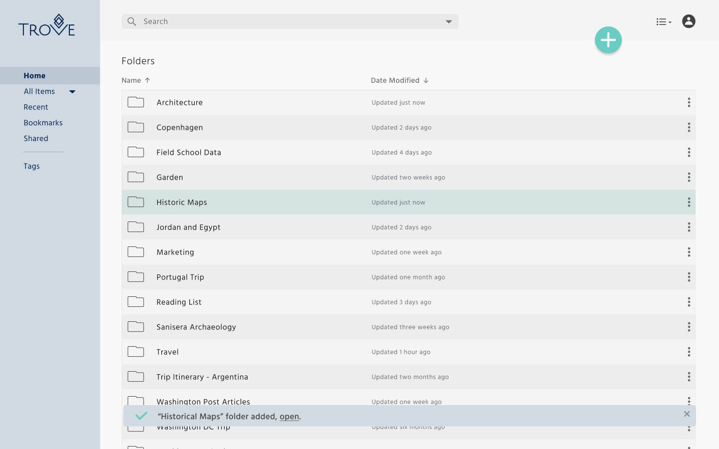
After establishing how users would interact with Trove, I needed to organize the structure of the site. I did this by identifying all the destinations in the user flows and structuring them into a logical framework.

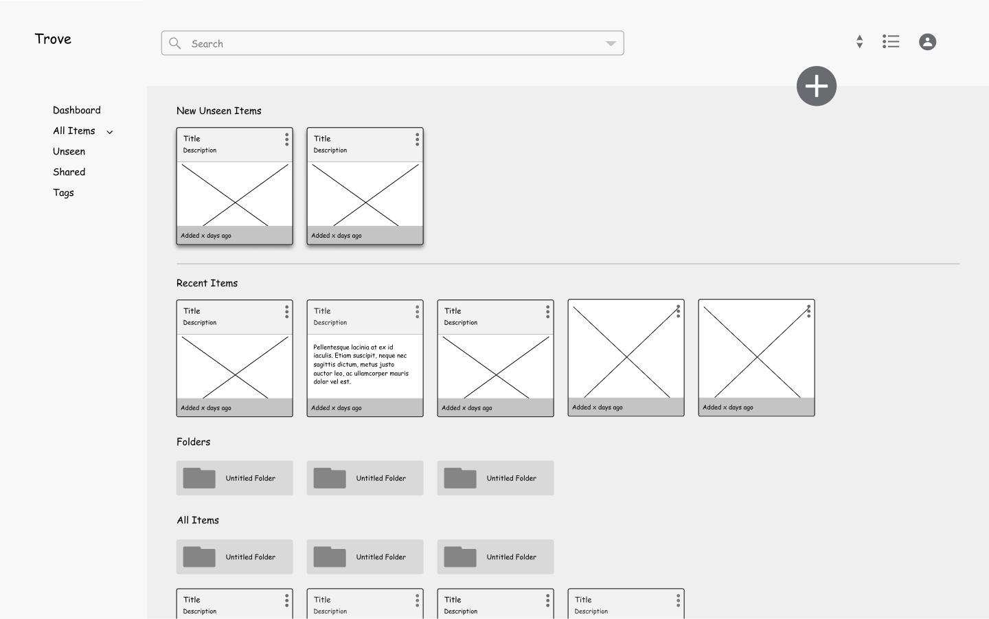
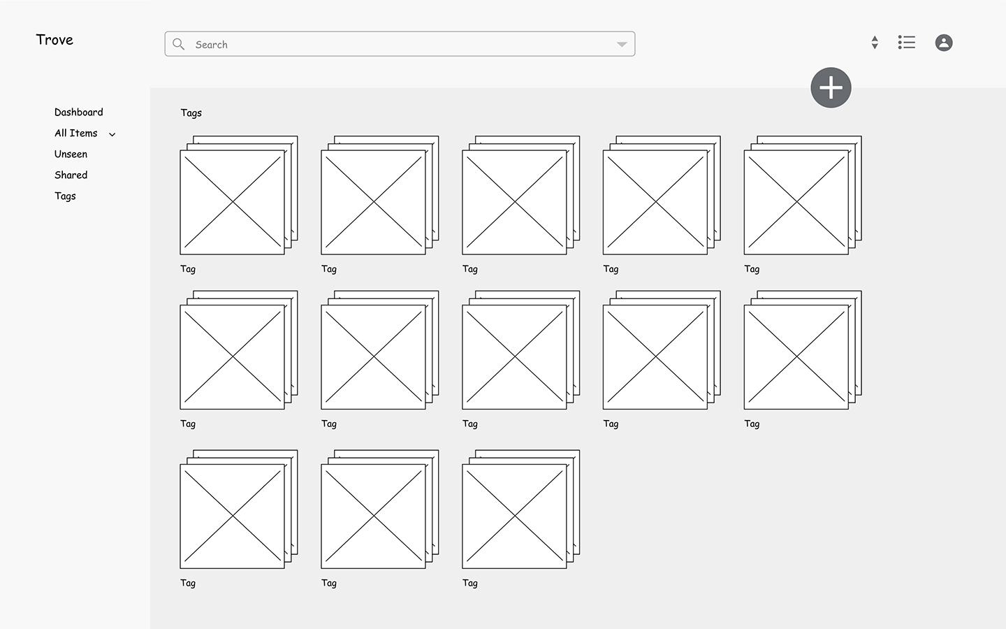
With Trove’s hierarchy defined, I began sketching early mockups to visualize information on the page looking to the user stories, user flows and site map for guidance. I did continuous rounds of sketching focusing on simple navigation and intuitive ways to organize.
Strategic design decisions:
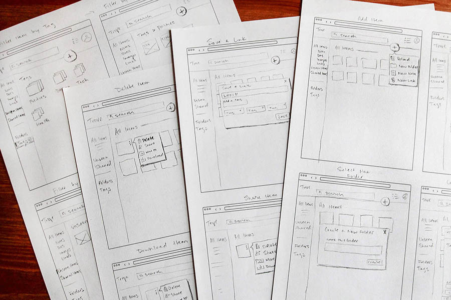
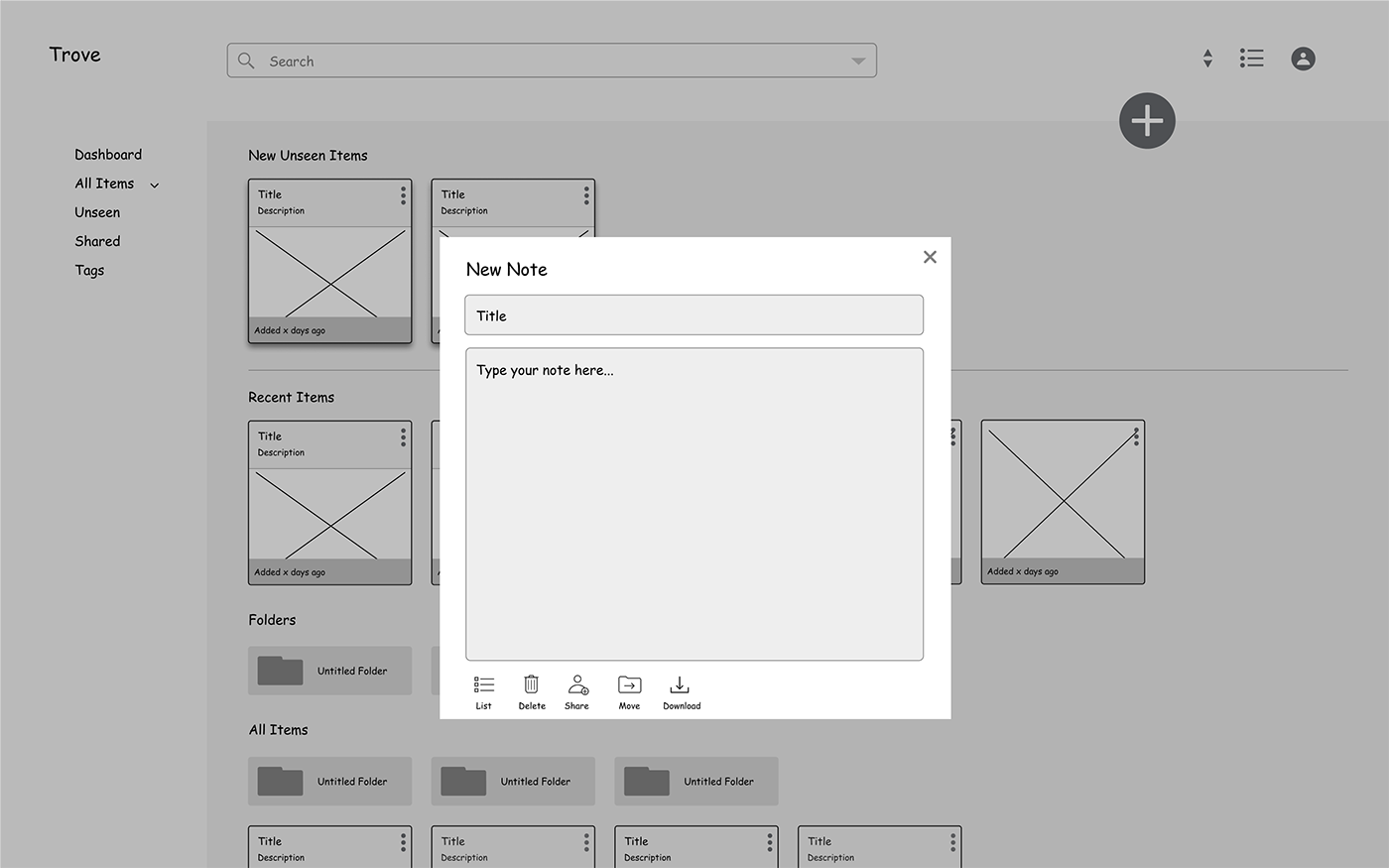
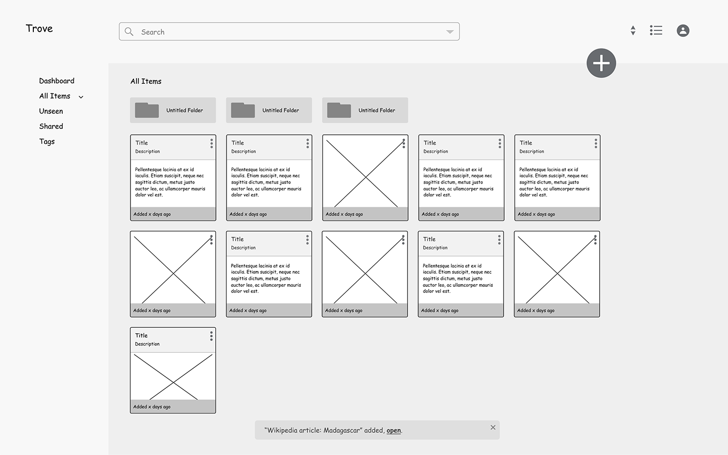
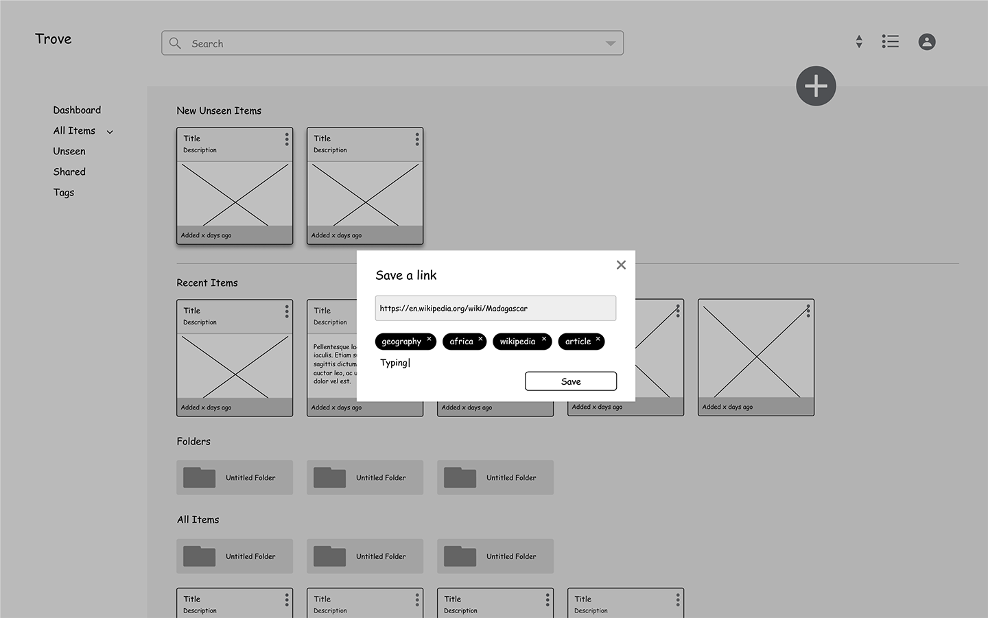
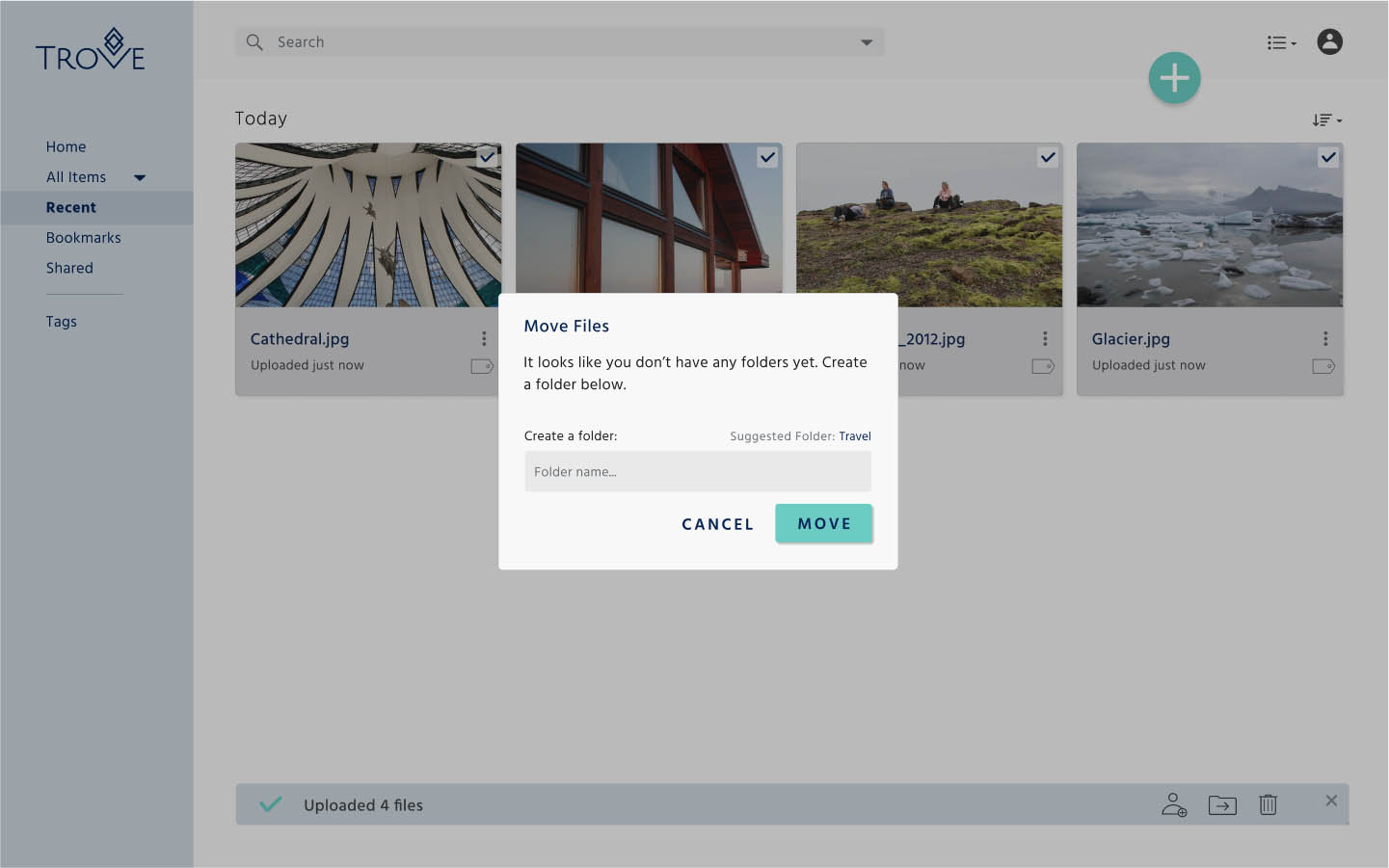
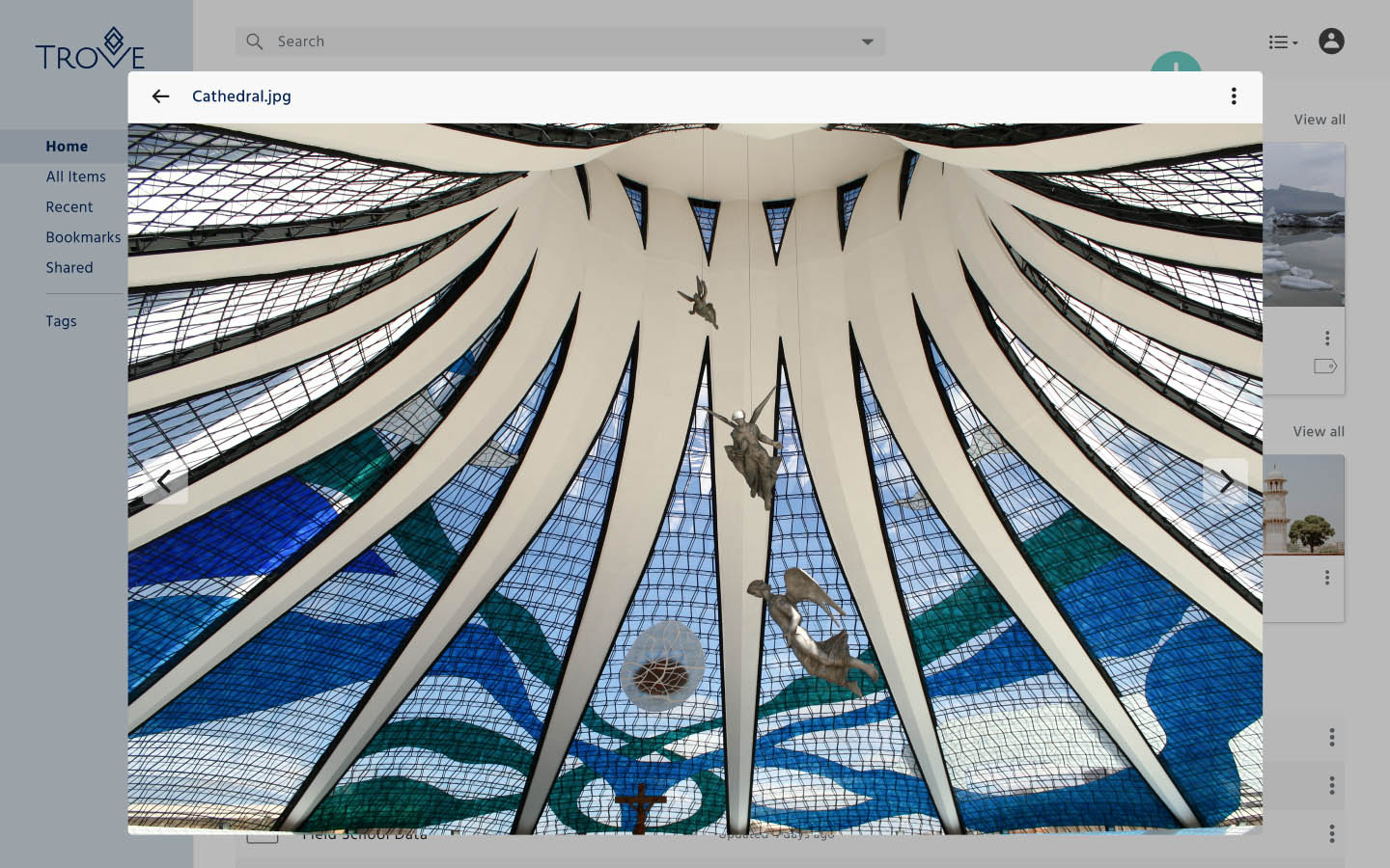
I worked through several iterations of clickable prototypes before conducting four usability tests to collect early feedback. Users successfully navigated crucial flows, such as signing up for a new account, adding note, uploading a file and sorting content by tags.
Based on the user feedback, I made the following changes:

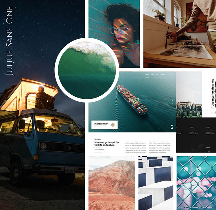
Trove serves a digitally savvy user population with an insatiable curiosity to learn and share with their communities. They are smart, engaged individuals seeking a product that fits their lifestyle. I landed on the brand name Trove, which is defined as a 'place to gather and store delightful things,' such as treasured content users collect and save.
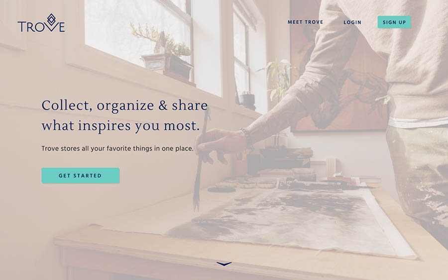
I chose a color palette that was calming and relaxing to reduce stress. The blue exudes dependability and inspires trust, while teal is rejuvenating and associated with clarity of mind and creativity.
For the typography, I paired the modern serif Lustria with the clean lines of Hind to promote readability and style.

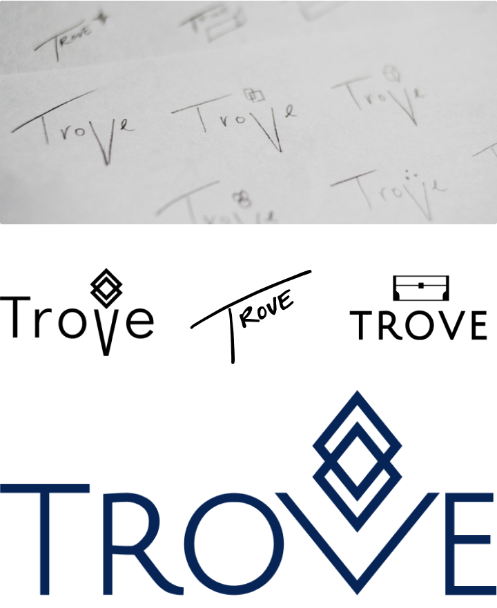
I went through several sketches before landing on the final logo with input from senior designers. I ended up with three directions for the logo:
Ultimately, the first direction felt the strongest. I developed on a simple wordmark in Julius Sans One with an accompanying icon. The typography has a sophisticated touch that makes it feel balanced and reliable. While the curvature of the ‘R’ adds a bit of personal flare. The diamond icon is versatile and stands out on its own as a memorable icon.

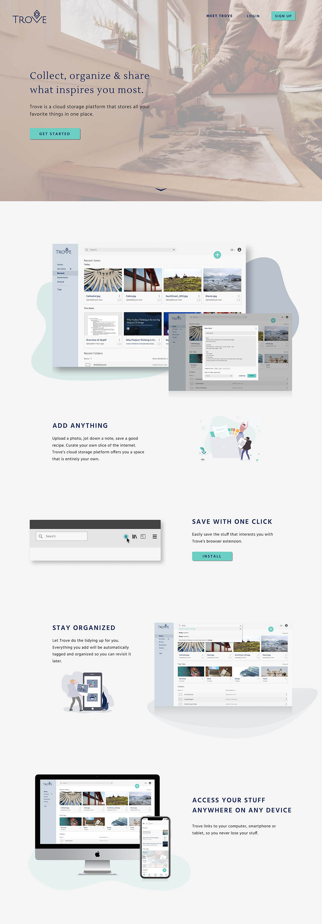
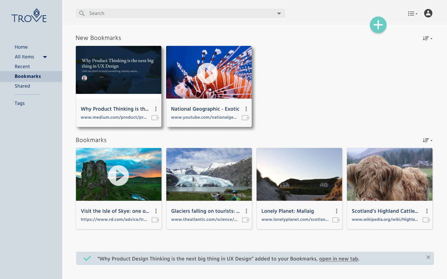
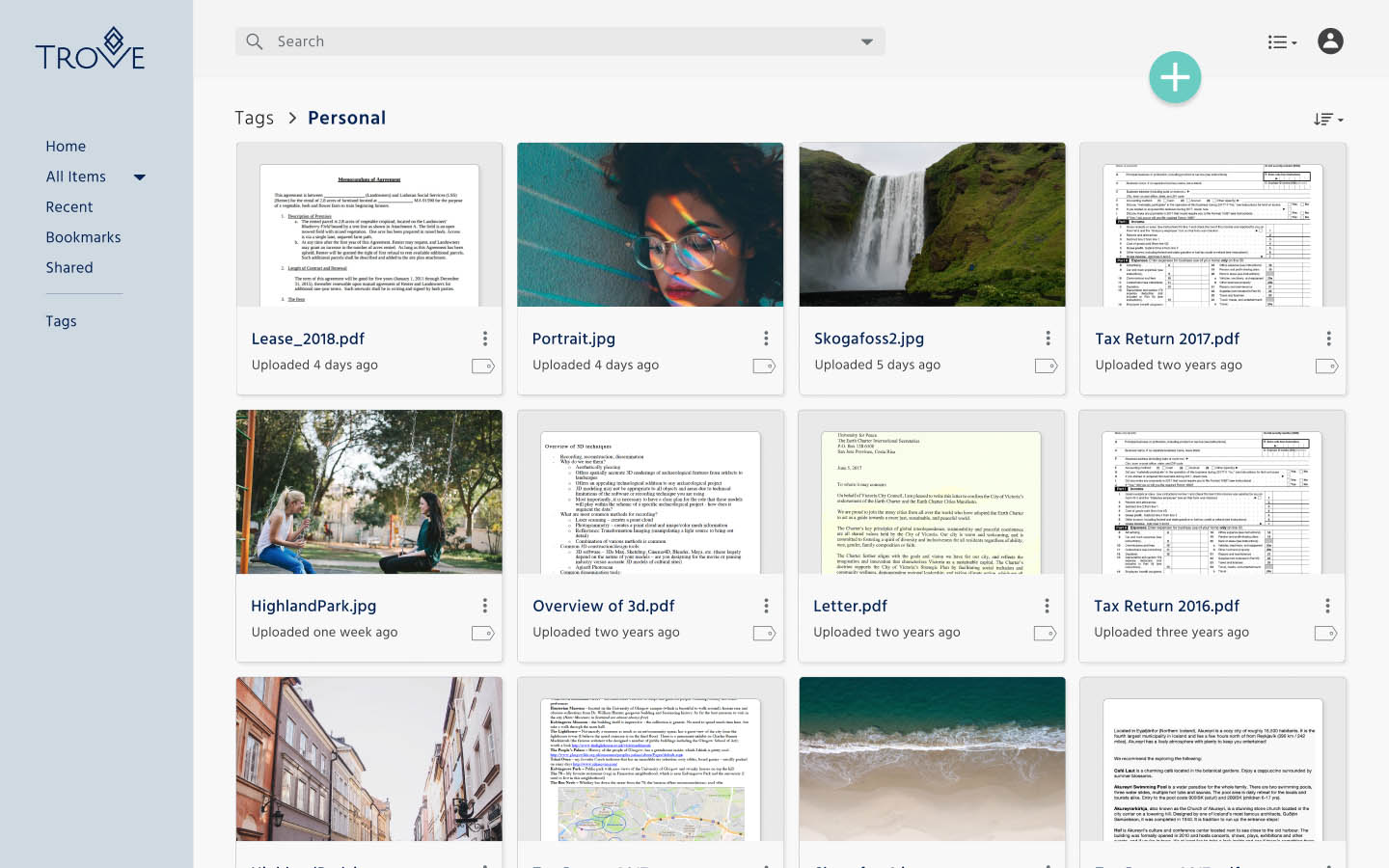
After gathering some early feedback from user testing and developing the brand identity, I transformed my wireframes into high fidelity mockups breathing life and color into the final prototype.
To test some of my design decisions, I conducted several preference tests using UsabilityHub and consulted senior designers.
Screen A
Screen B
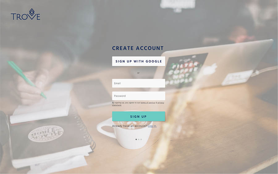
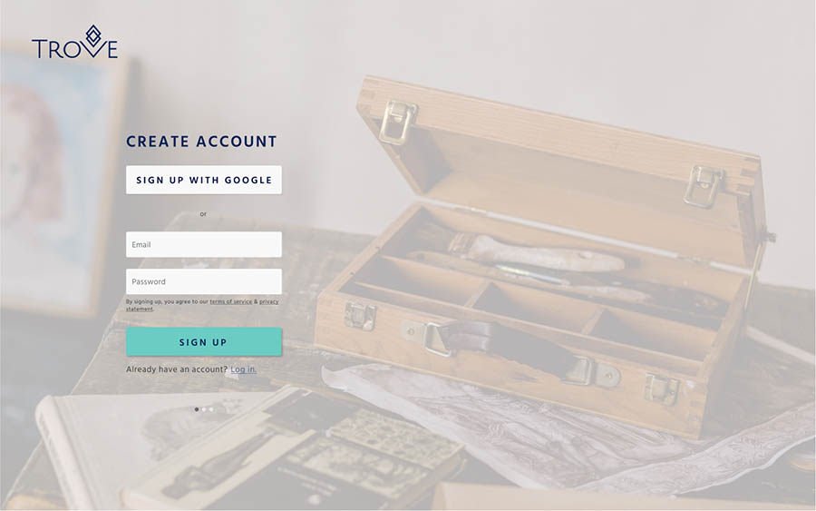
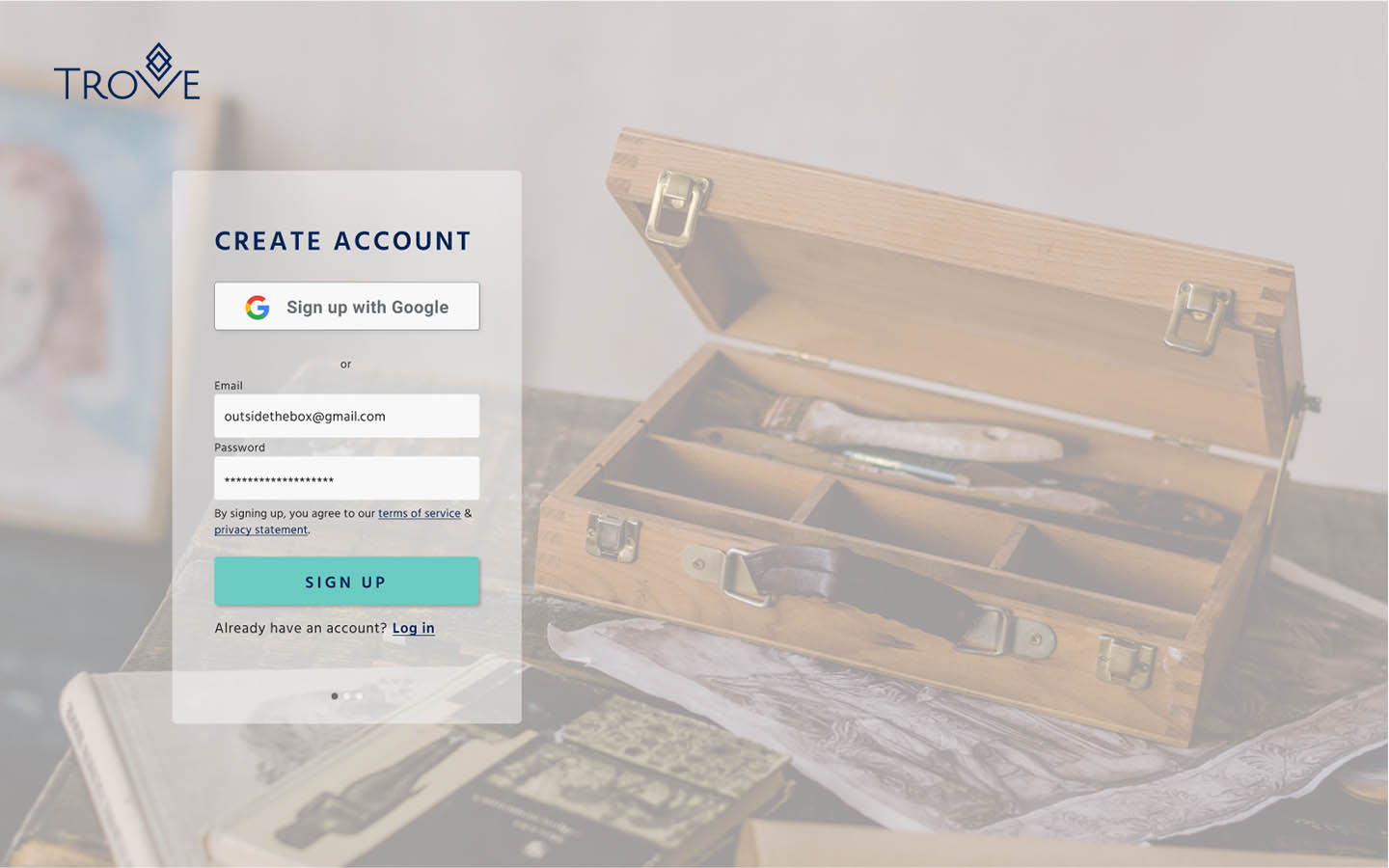
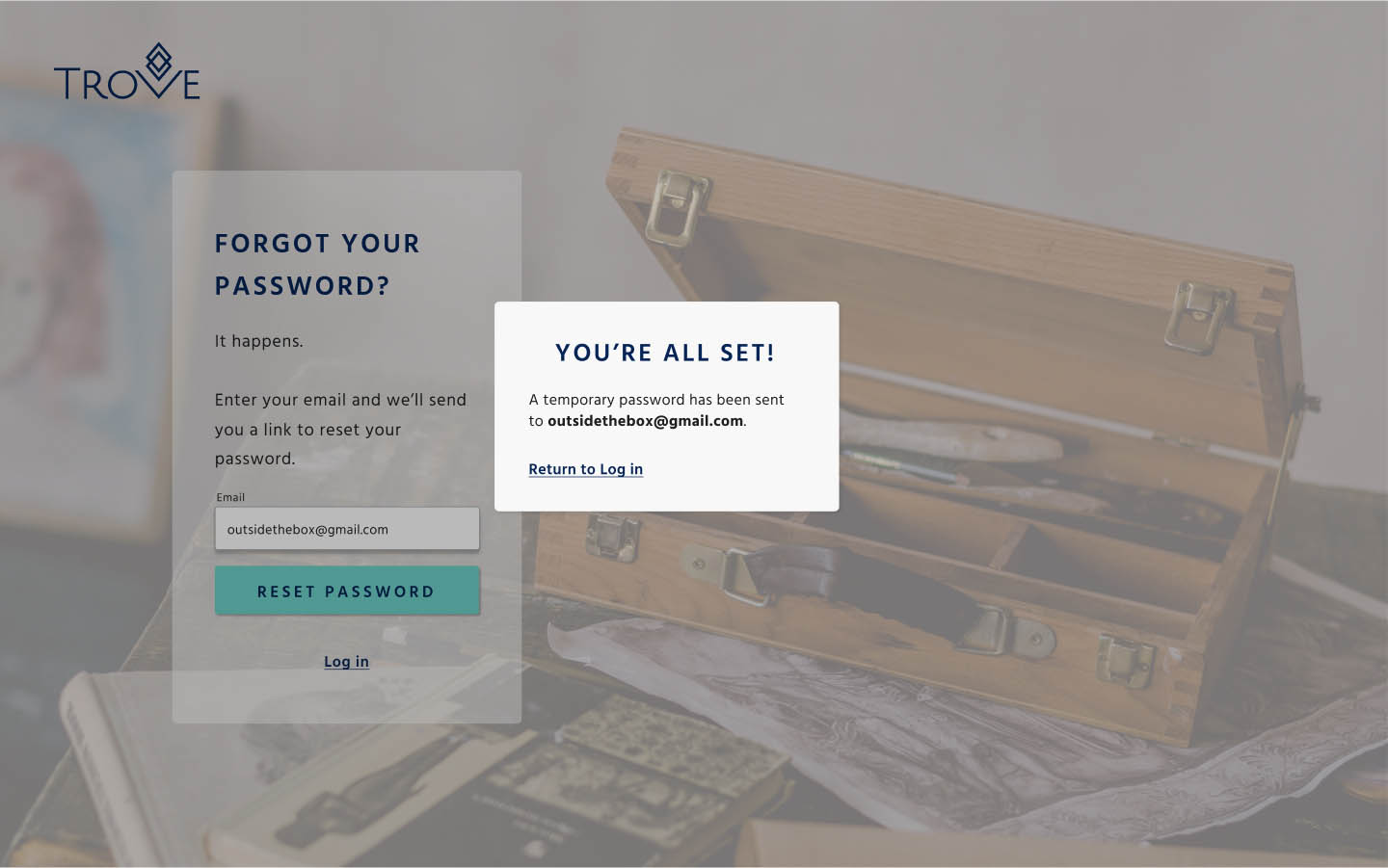
Content Preference Test: Sign up background images
I asked users which sign up background image best reflected the brand identity. I included the hero image for context since it provided the clearest insight into the branding direction.
Although the data wasn’t statistically significant, users felt that both images conveyed a similar calming and positive vibe. Users felt that Screen A followed the brand identity slightly more.
*Based on 26 participants
Using my high fidelity prototype, I conducted another four usability tests to assess how users handled crucial user flows and how they responded to visual elements.
Tasks tested:
Armed with fresh insights from my users, the following was clear:
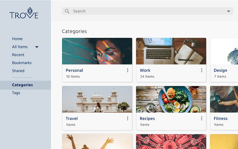
1) The categories weren’t working. Several users didn’t understand the functional difference between categories and tags. I realized they were absolutely right. I wanted to make it easier for users to organize, but I soon
realized it was at the expense of other organization features that had been validated by user testing, so I nixed the categories!
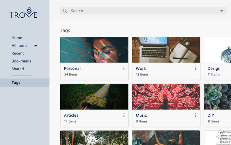
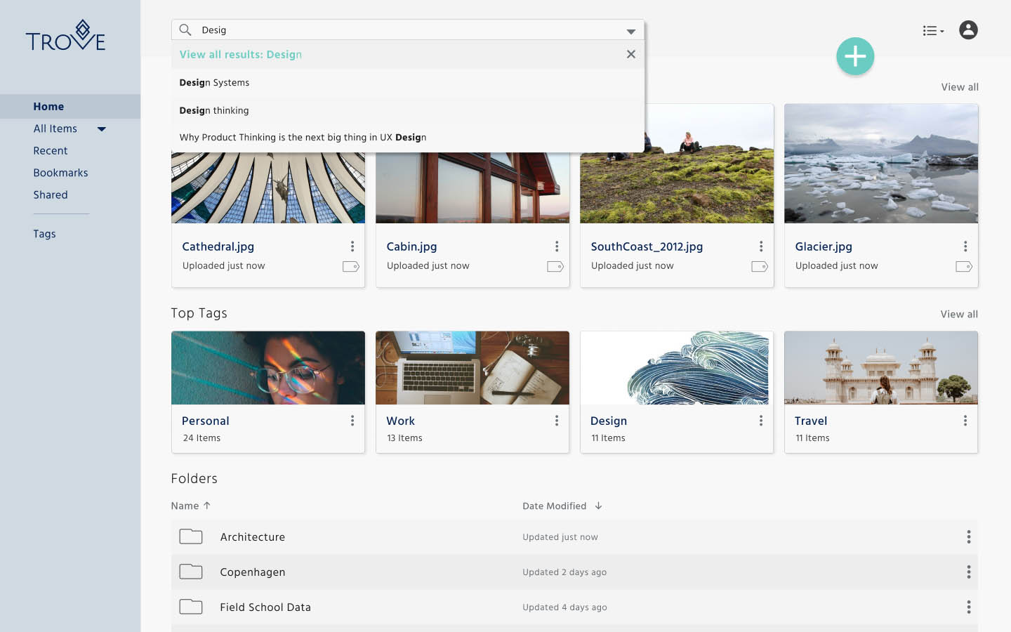
2) Viewing tags was less important than I anticipated. This was something that I tested through preference testing, but the results were not statistically significant, so I followed up with my users during testing. On the whole, users preferred a clickable icon to view all the tags in a dropdown. Users also noted that it made the interface feel less cluttered when the tags were accessible via an icon.

3) Clarifying the product’s tagline wasn’t a bad idea. Although most users agreed the hero image was inspiring and reflected the creativity brand, I modified the sub-tagline to include the term “cloud storage tool” to reinforce that this was, in fact, a cloud storage application.

After spending several days linking over 70 screens and modal windows, I finally had my MVP.

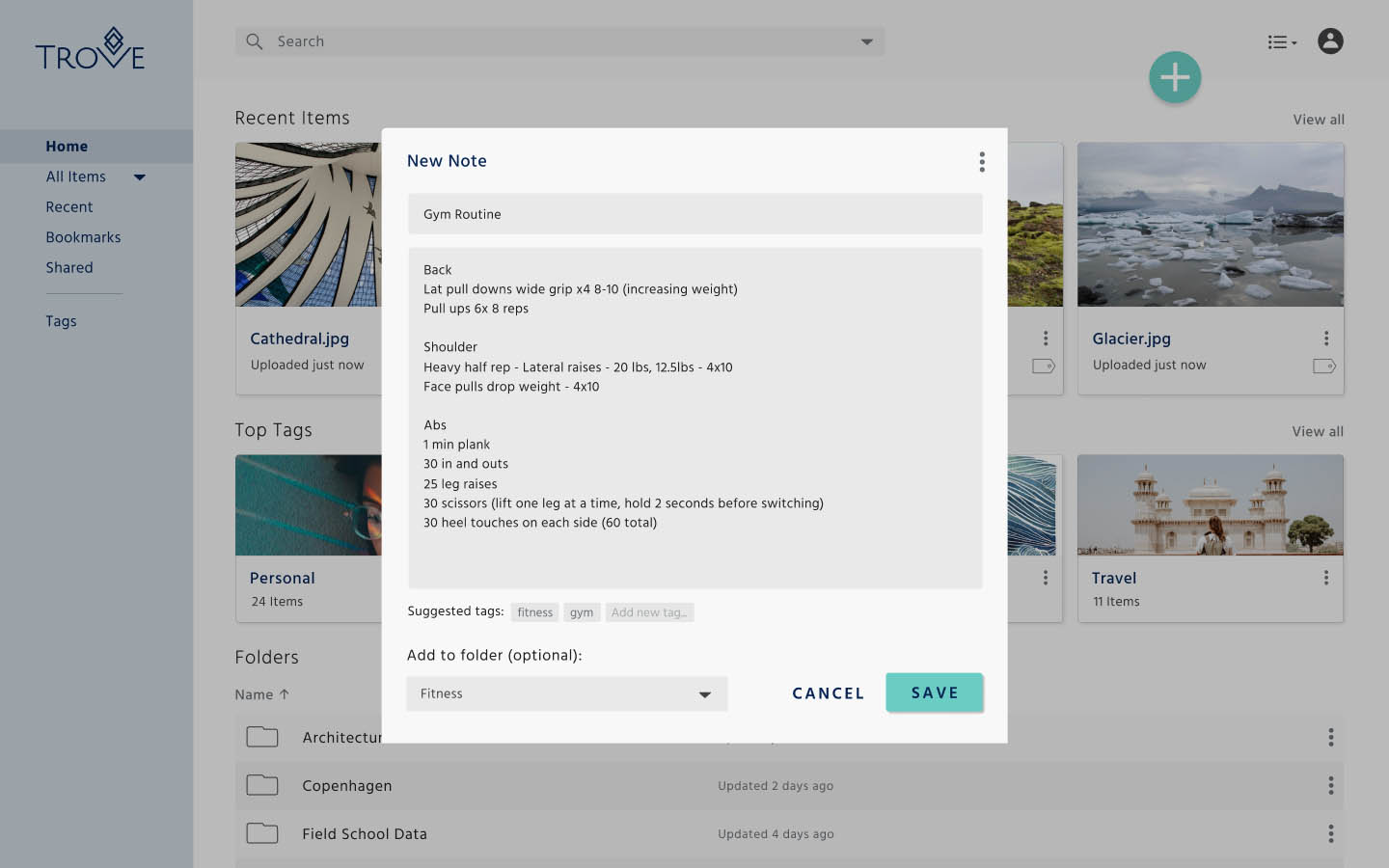

I sought to create a flexible storage space that allowed users to upload, add, and save content easily, and the user testing proves that these tasks were highly intuitive. One thing I did not expect was how the product started to align with a personal cloud storage space rather than a space that fit the needs of users both professionally and personally--likley because the sharing and collaborative features could use more work. With more time, I would improve the existing organizational features to streamline smart tagging in every user flow, not just the high priority ones.