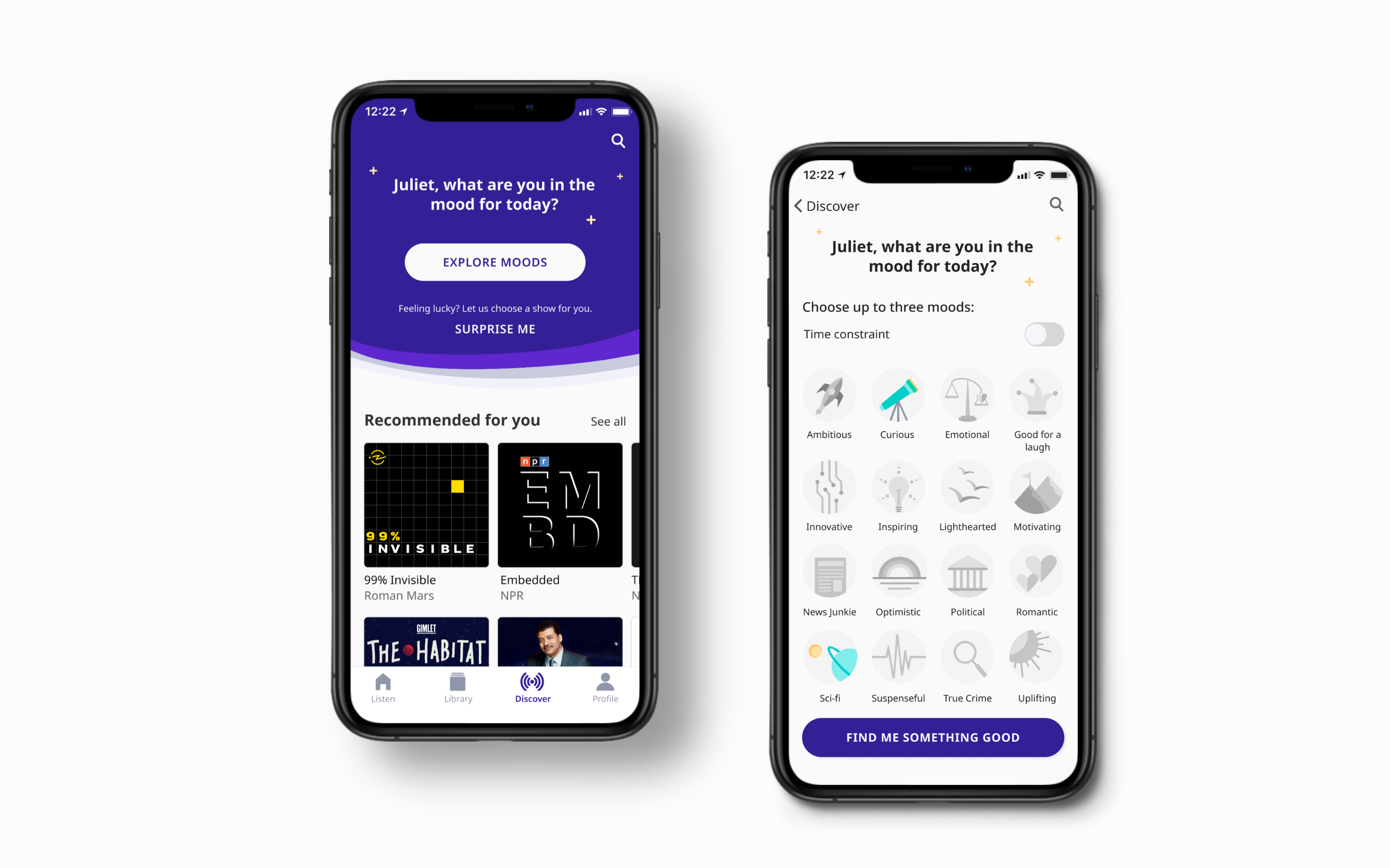
Current is an end-to-end user experience for podcast enthusiasts. Users can listen to podcasts based on their mood and interests, discover new content, and swap recommendations with friends.

The Problem
If you are a fan of podcasts, discovering a new show is a process. I find myself asking: What do I feel like listening to? Where should I look first? What’s in right now? Who can I tap for a good recommendation?
One problem is clear: there’s an ocean of content out there. How can we sift through it to find the shows that we want to listen to? And more specifically, how can we make the discovery process a little more enjoyable?

The Solution
Current makes discovering new content fun!
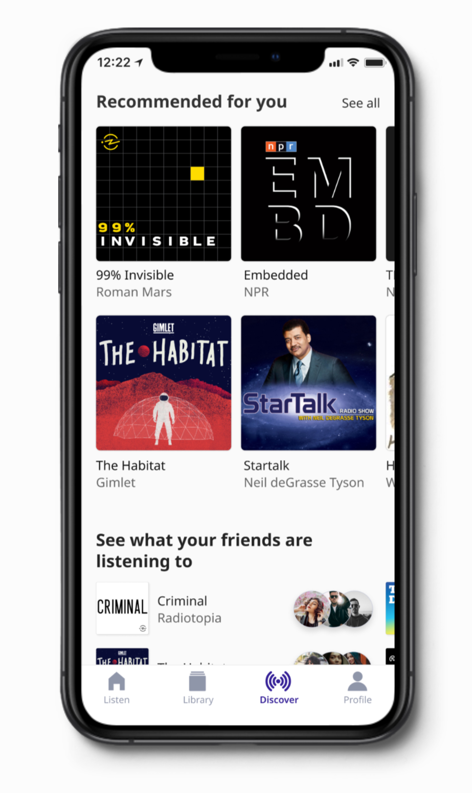
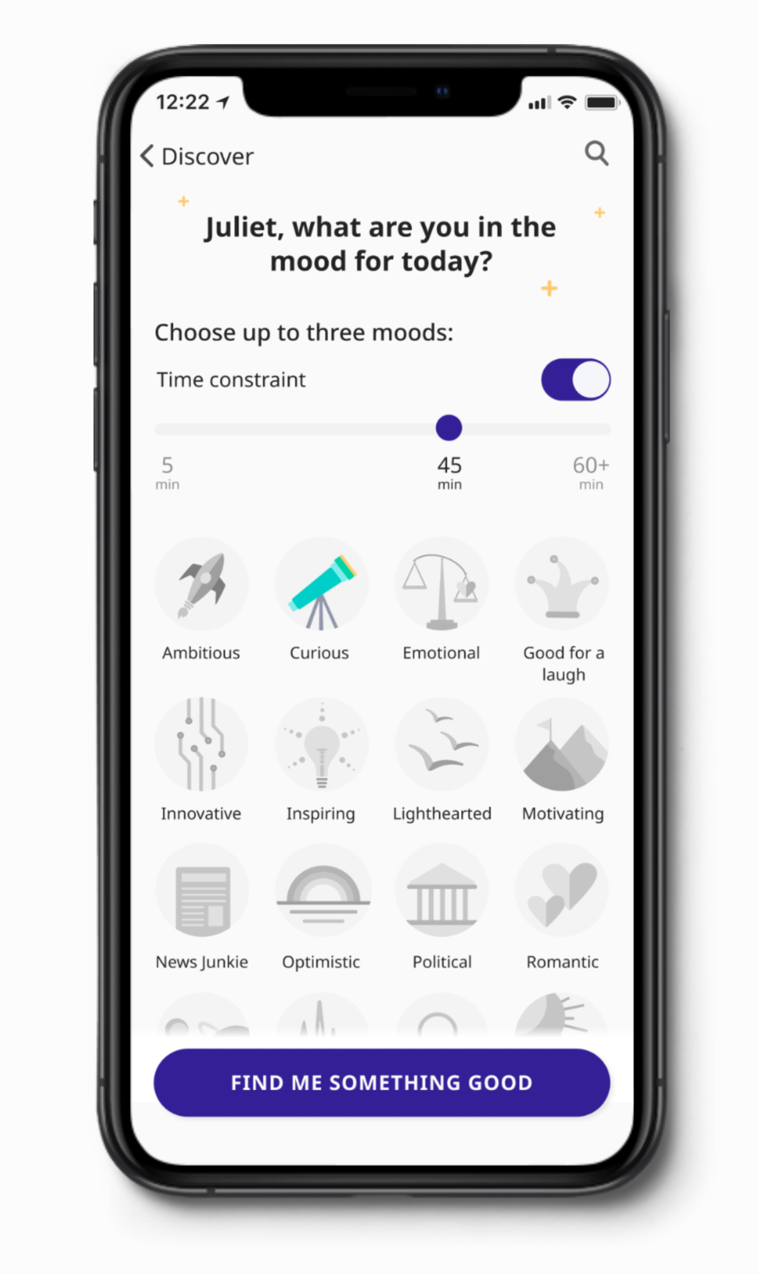
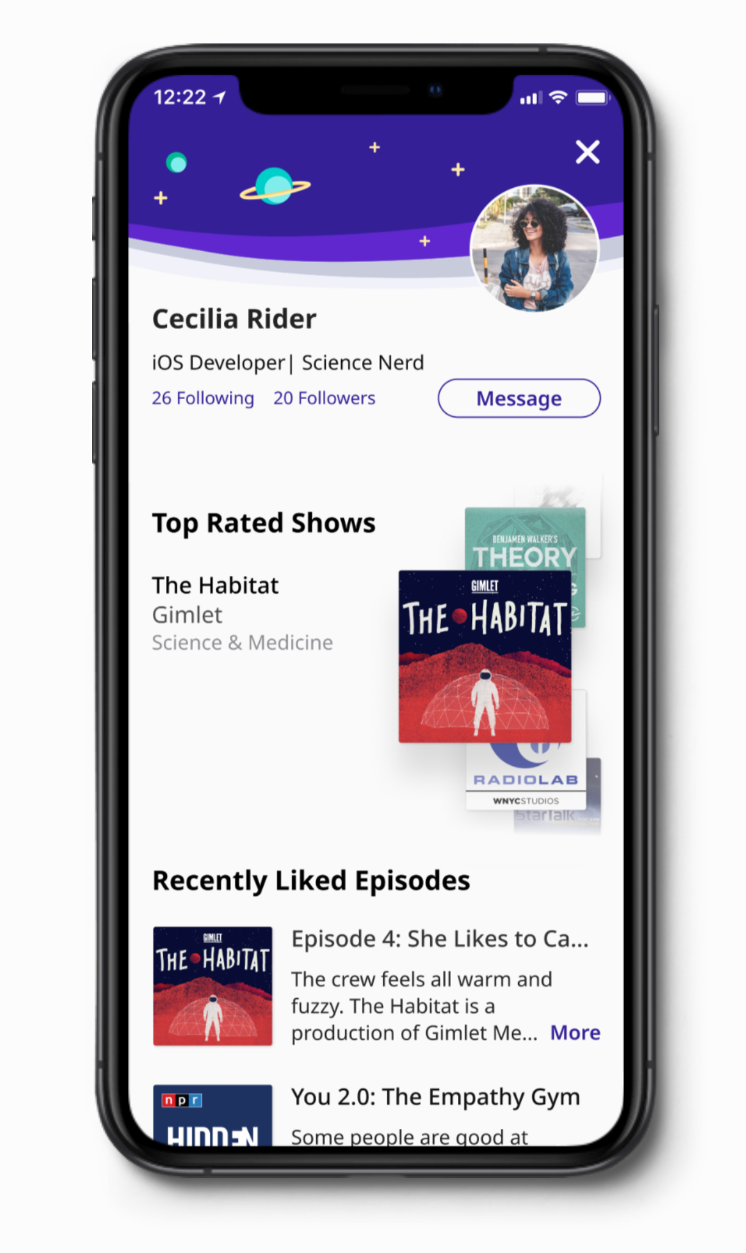
Podcast listeners want their explore feeds to be personalized and smarter so they can spend less energy finding and testing podcasts, and more time listening to content they actually find interesting. The app curates high quality shows based on the user’s current mood. They can also swap recommendations with friends and find out what’s in right now.
Current gets people finding and sharing podcasts quickly. With increased listenership, opportunities open up for investors, advertisers, and podcast creators.

Personalized
listening

Discover
new content

See what your friends
are listening to
project summary
My Design Process
Over five weeks, I collected user and industry data, sketched 70+ screens & UI elements, cycled through three iterations of MVP requirements, built four sets of wireframe, tested multiple color schemes, conducted six usability tests, and built
two prototypes before arriving at the MVP.
Interested in my design process?
Roles
- UX Research & Design
- Content Strategy
- Branding
- Visual Design
Deliverables
- User Surveys
- Competitive Analysis
- Interviews
- Personas
- User Stories & Flows
- Sketches
- Wireframes
- User Testing Results
- Branding
- Prototypes
Specs
- Duration
- 5 weeks
- Tools
- Figma
- Adobe Illustrator
- Google Forms
- Niice
Conclusion
Lessons Learned
Throughout the process I learned so much about what people expect from their podcasting apps. I received a flood of suggestions during user testing for new features and ways to take the app to the next level. Naturally, I wanted to implement all
of them, but I quickly learned how to absorb feedback and prioritize my effort to work within time constraints.
More generally, I learned that you can create amazing things in five weeks. By embracing experimentation, self-reflection, and consistent feedback, I was able to identify gaps in my workflow, prioritize my decisions, and stay focused on the
MVP. I also learned to trust my users, document my process, and repeatedly test my assumptions.
A full case study is coming soon...